Tazo Tea Redesign


Process Sketches


Colors


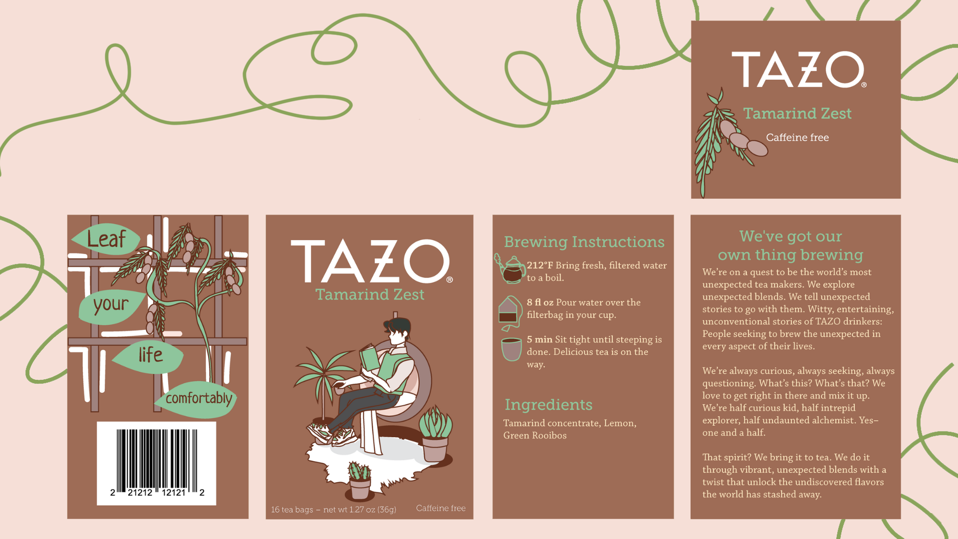
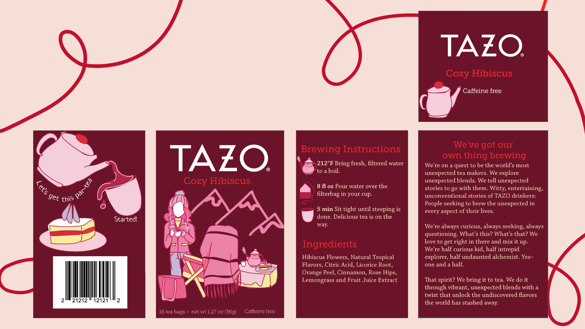
Design Spreads


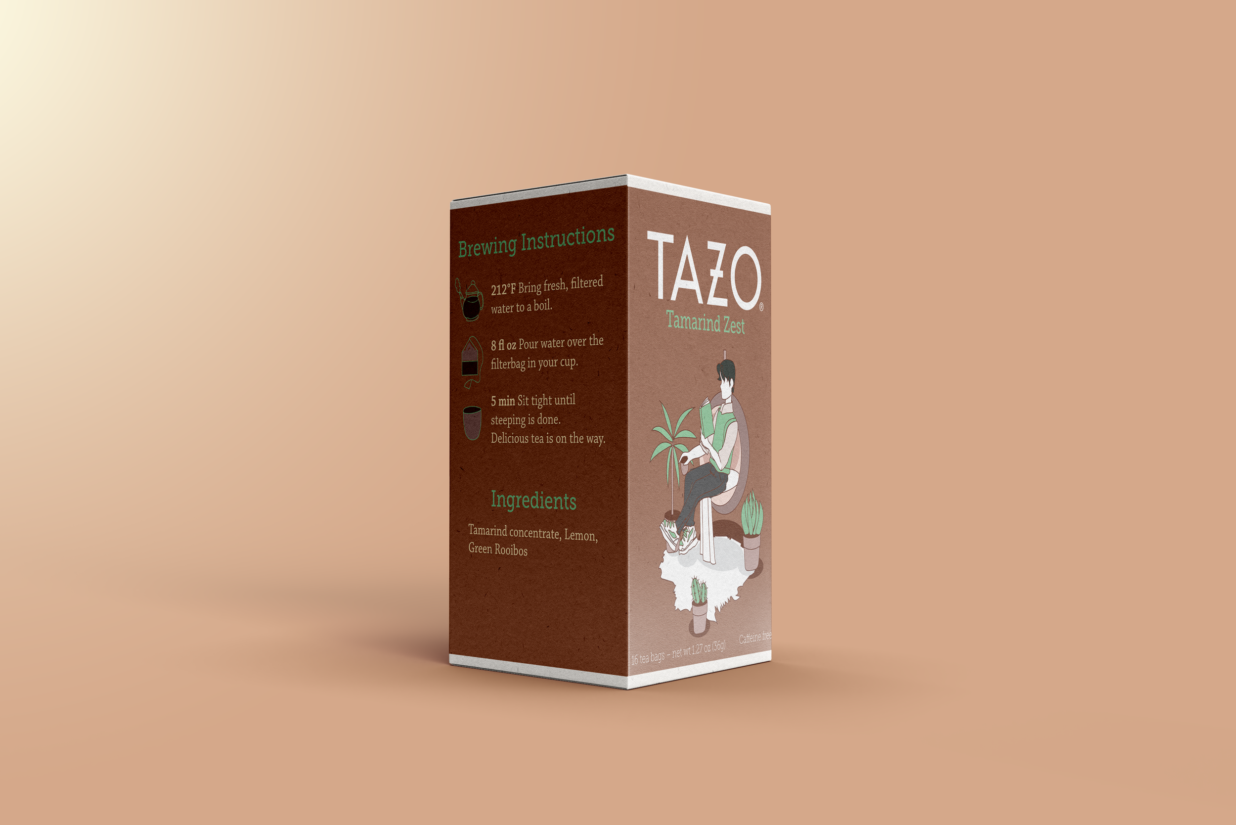
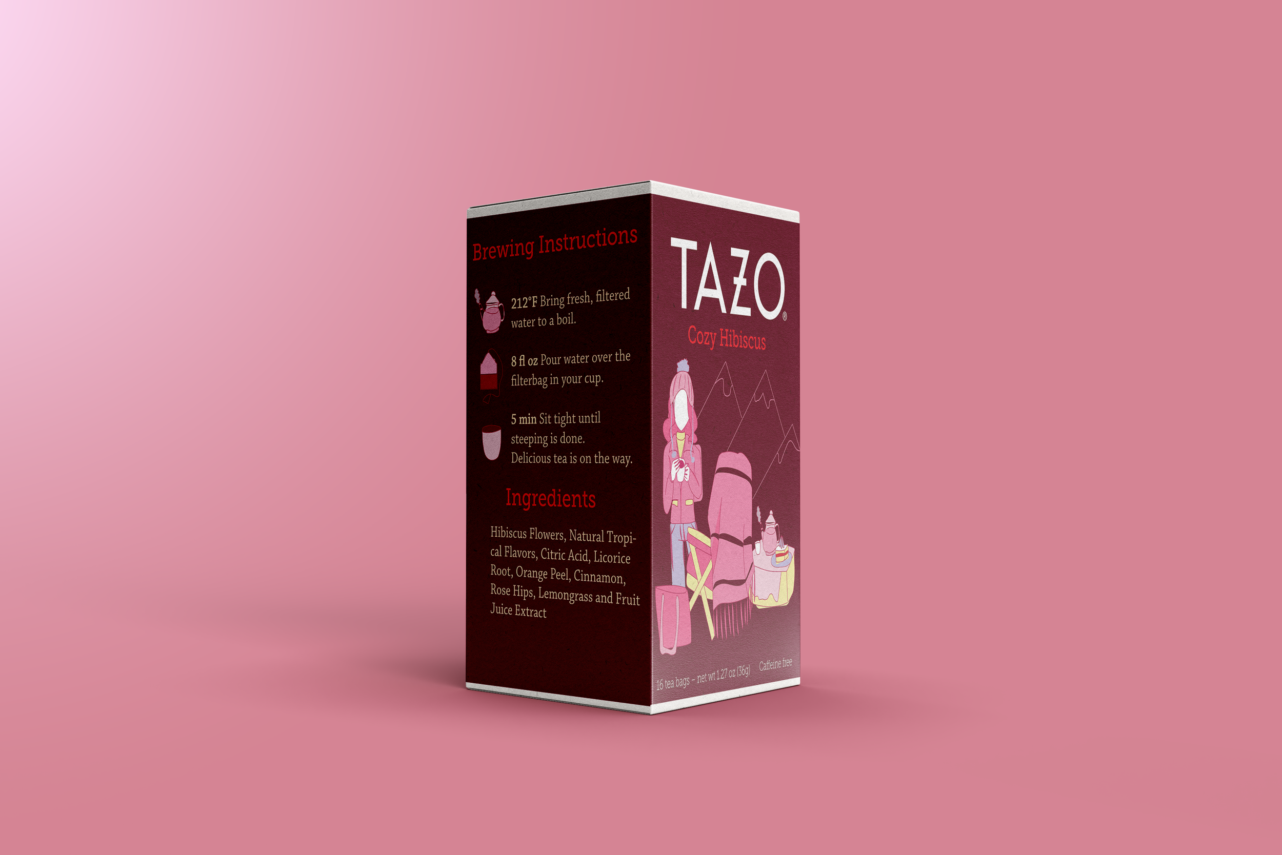
In this project, I was tasked with redesigning Tazo tea boxes by making them into a coherent series of designs. I was allowed to choose the flavors and the subject matter on the box and I chose tamarind, hibiscus, and peppermint. I chose these flavors for their popularity in my home country during both the summer and winter seasons. I gave each flavor a unique name and even named one in Spanish as a reference to what inspired the design.
In a minimalistic style, I wanted to portray the comfort of tea and the environments where people would regularly enjoy it. This is why I chose the settings of a house, an art studio, and a winter picnic.
I wanted the background colors to represent the flavor of the tea, which is why I chose burgundy for the hibiscus, green for peppermint, and brown for the tamarind. I chose to make the rest of the colors a little more muted and simple, while still complimenting the main hue.
